I was not paid by Aromaleigh for this review, and I purchased the products with my own money.
Aromaleigh Cosmetics released Mission One of their Galactic collection earlier in 2015 and will be releasing Mission Two later this year. It was first projected to be released in May 2015, but the release has since been pushed further back. It is part of their permanent eyeshadow collection (and I bought it before their big 20% off sale - but haven't swatched it til now - because I require instant gratification but am also a sloth at the same time so try and wrap your head around that one).
This collection was inspired by various color composite imagery originally by NASA, which I think is phenomenal. I'm in love with my BH Cosmetics Galaxy Chic palette, and this collection is like its classier older sister. I don't know why I am so intrigued by space and astronomy inspired collections; I get really bad vertigo on Space Mountain and almost threw up watching Gravity in 3D, but maybe that was just an allergic reaction to Sandra Bullock. I think it's The Unknown Factor - y'know, the fact that our existence is just a blip in the grand scheme of things, and even the whole planet is just a teeny speck of matter in the universe. *cue Murakami's Sputnik Sweetheart, which, fun fact, is my absolute favorite piece of literature, ever. cries.*
Date order was placed: April 13
Date order was shipped: April 16
Date received: April 18 (shut up. i'm a sloth.)
I had no issues with their email updates or tracking, and did not have to contact customer service throughout this process. The items were shipped and delivered quickly - probably one of the fastest TAT-s that I have seen with an indie company.

Here's a photo of their packaging and the "Thank you!" sticker that accompanied it. Pink freaks me out a little but I'm willing to do some deep breathing to get to the eyeshadow.

Here they are! Hai. One qualm I have had with Aromaleigh is that the stickers on their sample baggies are rectangular, unlike many other indie makeup companies, making it incredibly difficult (read: impossible) to transfer labels directly after depotting into 3g or 5g jars. It's just a little something, but it would make my life a whole lot easier! I can't stand baggies and am constantly paranoid that the little ziploc won't shut tight or I didn't align the two sides properly and they didn't snap together, much like when you are buttoning up a shirt and you're just one button off and you're like these next 30 seconds of my life are 30 seconds that I can never get back.
I am around an NC30, with strong yellow undertones (slightly bronze and olive). All swatches were done on NYX eyeshadow base in skin tone, over Too Faced Shadow Insurance, in mostly patting motions. I took these photos in my parking lot, and tried to move around with my left arm perpendicular to my trunk in order to get beamed up and my 85 year old neighbor looked at me like I was fornicating with a giraffe. Aka. I tried to get the best lighting to show the duochrome shifts.
From left to right, we have: Aquila, Casseiopia, Carina, Cepheus, Monoceros, Musca, Oculus, Ophicus, Orion, and Striga.

All color descriptions in bold below are directly from Aromaleigh's website.
1) Striga - A mossy green with a strong blue/teal duochrome effect. I definitely get more of the blue here, and looking at some other swatches online, that was the case with them as well. The mossy green peeks through but I do see mostly blue.

2) Orion - A warm chestnut brown with a strong green duochrome shift. This shadow is absolutely beautiful. It's a little more green in person than seen here. My Achilles' heel is blue/green shifts over a red/brown/maroon/burgundy base since MAC's Blue Brown was my first duochrome and the first time I used it, I definitely had an eyeshadow O in my pants, ifyaknowwhatimean.


3) Ophicus - A warm violet to gold duochrome, with gold shimmer. I see a little more fuschia/pink here than a true "warm violet" as seen on the website, but that makes it more Rapunzely and I'm totally ok with that. The website's swatch does lean more violet than this.


See, doesn't this shade just remind you of this:
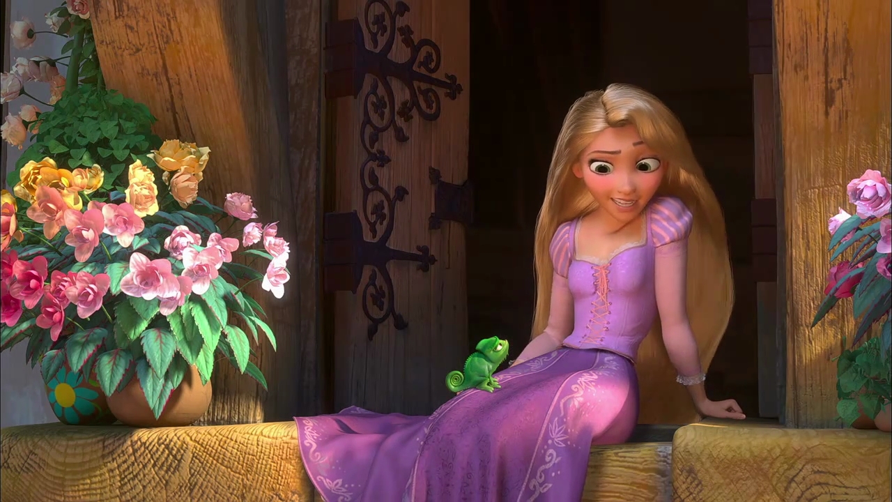
No? Just me? Ok, I'll go paint on my walls alone then.
4) Oculus - A regal cool purple with a strong gold duochrome shift. Again, this is more of a lavender color after patting on two layers, whereas the website's swatch is deeper but definitely in the same color family. The gold is more prominent in Oculus than it is in Ophicus.


5) Musca - A rich blue with a strong gold duochrome shift. The base color applied more patchily than the others on my arm at this point in time, but still really beautiful.


6) Monoceros - A vivid pink-violet with a blue duochrome shift. I don't really get a blue duochrome shift here, and from the swatches I've seen, I don't really see it there either, but it is definitely a vivid pink-violet, and is extremely pigmented. This was by far the most pigmented of the ten shadows and did not need the same amount of shadow on my brush to achieve the same opacity as the others.


7) Cepheus - A rich chestnut brown with a strong blue/lilac duochrome shift. This is my favorite shade in the whole collection. I told you I liked brown bases with blue shifts ok don't make fun of me I warned you it was coming QQ. This color especially really accentuates my brown eyes and adds dimension to them. I'm in love.


8) Carina - A rich violet with a strong teal duochrome shift. This shade reminds me of a darker version of Shiro's Alkahestry but is just as beautiful. Alkahestry's blue is actual glitter though, if I remember correctly, whereas this is a light, but prominent shimmer. Carina was also among the more pigmented of the bunch.


9) Casseiopia - A deep blackened brown base with a strong red duochrome shift. I get a lot more purple than I do red. As well, I was slightly disappointed that the base was not as opaque as I would have liked it to be, and I had to cake on quite a bit of shadow to achieve the opacity that I did. Looking at other swatches online, they are also more purple and black than the original Aromaleigh swatches.


10) Aquila - A vivid teal green with a gold duochrome shift. My swatch is more blue and also lighter than the website's swatch, but I actually like it better here than on the website, so I guess that is a win for me! If you know me, you'll know that my obsession is minty green-aquas with gold shimmer (or without, I suppose - I'm not picky) such as Shiro's Farore's Wind and Baroque's Dragon. The gold here is extremely prominent and I'm really excited to use this one in different looks!


Overall, I love the idea behind this collection and I cannot wait for Mission Two. I think it's important to keep in mind that we can apply TONS of eyeshadow to our arm because it is a relatively flat surface made up of thicker skin than our eyelids, and thus, the swatches that we see here and on most websites are probably going to be different when actually applied to our eyes and with different lightness and heaviness of application. Next up will be a review of some eyeshadows from Corvus Cosmetics, which is a company very dear to my heart. And I'm watching Tomorrowland tomorrow in IMAX! (I'll take Dramamine beforehand, don't worry if you happen to be sitting in the few rows in front of me.)
