I was not paid by Brija Cosmetics for this review, and purchased all products with my own money. I did not have to contact customer service at any time during my transaction.
Date order was placed: May 23 (with a 10-14 day TAT)
Date order was shipped: June 2
Date received: June 4
My samples came in a paper bag with a bright, sunny floral pattern and a Brija Cosmetics round sticker. I ordered all eyeshadows from the 90s collection, all eyeshadows and the one highlight from the One Tree Hill collection, and all blushes, the one highlight, and the one contour shade from the Mean Girls collection. I also ordered lid stickers for these three collections, which is a beautiful and inexpensive option that Brija offers. Most indie companies only offer artwork with full size purchases, so this was a great bonus for me, as the inspirations for these collections really hit me in the feels.

The order also came with a GWP, an eyeshadow shade called "Topless Photo", described on their Facebook page as a warm, shimmery peach. I had some high expectations for this shade, as formulating any topless photo is an art form on its own. Swatches coming below!

All swatches are done over Too Faced Shadow Insurance, and the shimmery/glittery shades were done half over Too Faced Shadow Insurance, and half over Fyrinnae's Pixie Epoxy on a base of Too Faced Shadow Insurance. My skintone is NC30 with strong yellow undertones, leaning slightly olive/bronze. All descriptions in bold below come directly from Brija's website or Facebook page.
The first collection I am going to review is the 90s collection, based off of various, mostly Nickolodeon shows from my 1990s childhood.

From left to right: Nigel's Adventure Vest, 90's Kid, Alone in the World, Angry B, Sass Queen, Not a Kilt, F is for Friends, Legends, Woogity Woogity Woogity, Quailman, The Girls' Room, and Topless Photo (GWP)

And a leeeeeeeettle more close up of the shimmery shades!

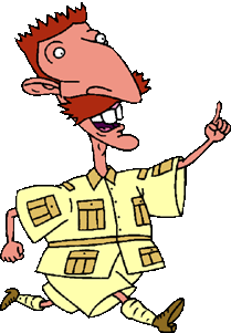
1) Nigel's Adventure Vest - A matte, pastel yellow that when blended out, looks almost white. This shade is a little lighter and less yellow than Mr. Thornberry's actual adventure vest khaki shade:
However, it is a wonderful matte formula. In comparison to the Dawn Eyes Spearl Matte formula, which I reviewed in a previous post, it is a little less creamy, but also kicks up a less excess and has less fallout when applied. When compared to Corvus Cosmetics's Euterpe, it is more yellow but equally opaque. This shade is... dare I say it... smashing!


2) 90s Kid - A light matte, almost nude, peach. This shade offers the same matte formula. I don't think I would personally use it in a lot of looks, as it kind of looks like I'm trying hard for a nude, but don't quite make it. I feel like this would be a great transition shade with a Jennifer Aniston, slightly peachy-mauve, brown lipstick (and some "honey blonde" highlighted hair with symmetrical butterfly clips, a classic 90s term, overalls with one strap undone, and white platform sneakers. Don't you 90s kids tell me you haven't tried this one before!)


3) Alone in the World - A matte medium peach. This eyeshadow was named after CatDog's house. I was perplexed to the point of juvenile frustration and angry-tears by CatDog as a child. Where does CatDog excrete wastes? Does CatDog excrete wastes? How does he check in on an airplane? One identity? Two identities? What is his class, order, family, genus, species? I mean, look. And why is that thumb so opposable, when all those other three feet/hands just look like clubs? I'm getting antsy. It's time for me to stop.
I have the same opinion about this eyeshadow as the above, although I'm more inclined to use this one as it is less trying-hard-but-not-hard-enough nude for me! I do feel like for the same collection, this and 90s Kid may be too similar, and maybe a better matte would have been a 90s grungy red.


4) Angry B - A warm chocolate brown. This eyeshadow was based on Angry Beavers, a show I did not watch, as it was on at the same time as Emeril Lagasse's cooking show on the Food Network, and as an 8 year old with an older-man crush on Emeril, I definitely passed the Angry B's up for him. This eyeshadow is a true, milk chocolate brown. I look for a little more cinnamony and less milk chocolate for a crease shade, but I can definitely make this work. However, it's a little too milky for my liking to get in a full size. The opacity was lovely, similar to the matte shades above.
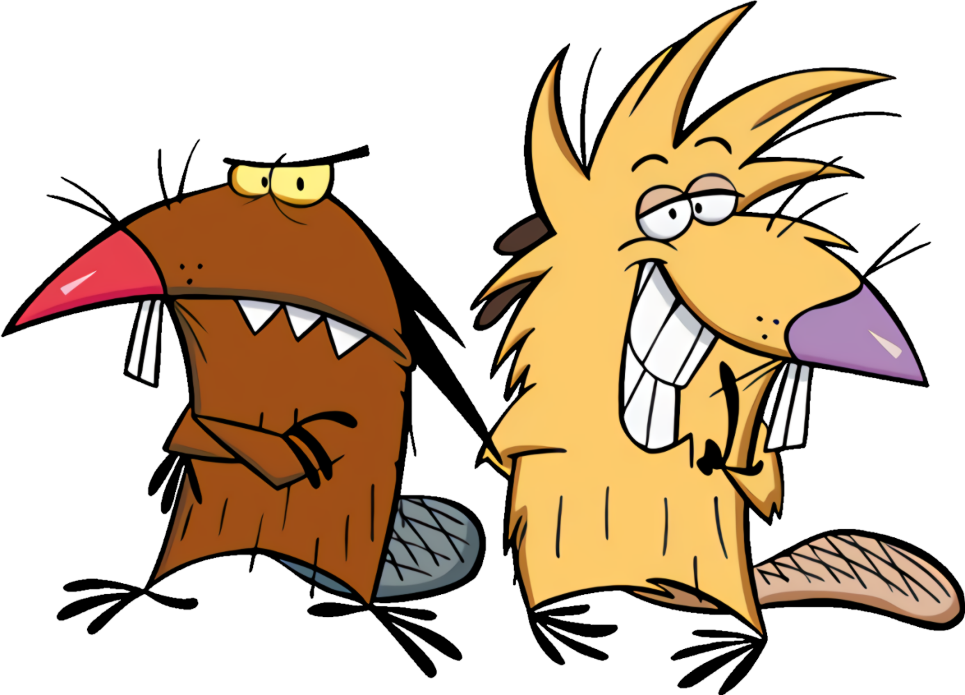
I mean, look at the one on the left. He's like "b*tch, I know you passed me up for Emeril."


5) Sass Queen - A medium purple with pink duochrome. Angelica is queen.

No, seriously. HIFW USPS says my package is delivered, but it's really just somewhere in Arkansas.

I personally get actually more than just pink duochrome. I see some gold and orange flecks in there too! Hey, I ain't complaining. Unfortunately, this shade did not perform nearly as well over just TFSI as over Pixie Epoxy.


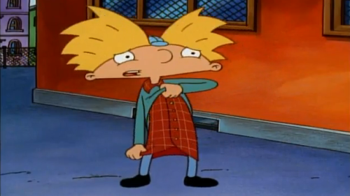
6) Not a Kilt - A medium teal with slight pink sparkle and duochrome. This shade performed equally well over just TFSI and over PE. You can hardly tell the difference!


And just in case you didn't believe Arnold, it's really not a kilt. I know, I'm just as distraught that he lifted up his shirt so high. I mean, what if it was a kilt?
7) F is for Friends - A golden yellow with blue sparkle. This shade is based on Spongebob Squarepants, who, I mean, I did like, but Patrick Star was the true love of my life. I would use his mayonnaise for an instrument any day, if ya know what I mean. Anyways. I digress. I would say that the sparkle in this shade leans a little more icy blue than a true, sea blue like you'd find in Bikini Bottom. As well, it is more sheer over just regular primer than I'd like, but not patchy. I would pass this up for some other more opaque, shimmery golds in my collection that would work better over just TFSI.


8) Legends - A deep antique gold. For me, this shade leans olive. Kind of like Dawn Eyes's Genie, but less green. It is a beautiful shade and performed very well over both PE and TFSI.


I will admit that I have no idea what Legends of the Hidden Temple, the show this shadow was based on, is at all. I've never heard of it or seen it. However, upon performing a Google search, I found this lovely explorer, his combover, khaki jorts, and too-long-too-wide button down. Guys, we are really in the 90s.

9) Woogity Woogity Woogity - A light magenta purple with a strong green duochrome. I used this shadow in a look that you will see below, and it is lovely. I will definitely be using this in some future looks. It does show up less purple and more pink on me, especially with some blending. It performs equally well with and without PE.


This shade was based on the show Rocket Power and the RPC's secret handshake. Can I just comment on how much they all look like some offspring or relative of Chuckie the Rugrat's? Like that one in the top left is straight up Rasta Chuckie, and bottom left could be Chuckie himself, only with larger clothes and a stronger interest in marine biology.

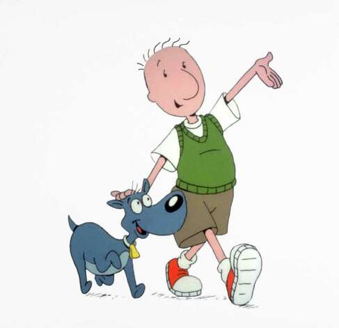
10) Quailman - A bright yellowed grass green. This eyeshadow was based on my #3 90s cartoon, Doug (also the name of my ex-boyfriend, and almost every time we were intimate, I would picture 90s Doug with his green sweater vest and exorbitantly large nose). #1 was Recess and #2 was Pepper Ann. Anyways. Sadly, not a shade I would use often, as lime green is not my jam. The yellow/gold is super apparent over PE!


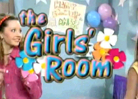
11) The Girls' Room - A light pinky coral with a strong green duochrome. The duochrome in this is definitely more apparent in person. It reminds me of a lighter, less fuschia version of Woogity Woogity Woogity. I have grown a liking for duochromes with pink bases, so I will attempt to work this one into some looks. It is a tad sheer, but again not patchy over just TFSI.


RIP Amanda Bynes of the 90s.
GWP: Topless Photo. This shade is lovely, but again, a little sheer over just TFSI. Over PE, it is an elegant shimmery-peachy rose.


Up next is the Mean Girls blush collection! I feel like blush swatches on an arm and bound by the harsh lines of tape is not the greatest way to view blushes, as we usually blend them out thoroughly on our cheeks to avoid looking like Lunette and Molly on the Big Comfy Couch. Also, if you are a Big Comfy Couch fan, please don't ever try and make 1:45 on the carpet clock. Your inner groin will thank you.
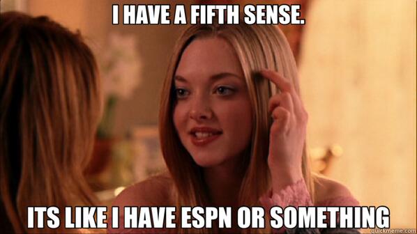
Here are the swatches! From top to bottom: ESPN highlight, Regulation Hottie blush, October 3rd blush, Jungle Madness blush, Beware of Plastics blush, and Glen Coco blush/bronzer/contour. I will only be posting swatches and the website's descriptions, as I feel like they performed well across the board on my arm and on my face.


1) ESPN highlight - A warm neutral highlight with hints of pink and gold shimmer.

2) Regulation Hottie blush - Neutral pink blush with a shimmering shift to purple.

3) October 3rd blush - An almost-matte true orange peach blush. It has slight hints of sparkle, but is the most matte of the entire collection.


4) Jungle Madness blush - Leans more satin than sparkly or shimmery, and is the perfect spring magenta.

5) Beware of Plastics blush - A gorgeous golden coral glow.

6) Glen Coco blush/bronzer/contour - Inspired by Illamasqua's Disobey blush.

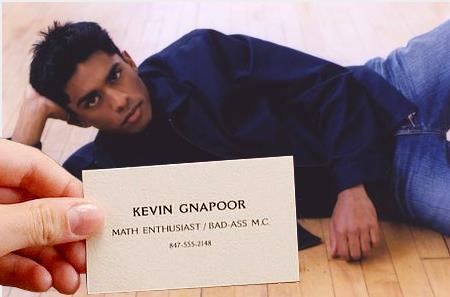
My only slight gripe with the Mean Girls blush collection is that I feel like there are not very many shades that darker-skinned blush appliers can use. Glen Coco, which is described as a bronzer, does add warmth to my looks, but I need a lot of it to appear, and I am a medium skin tone (NC30). Let's show Kevin Gnapoor some lovin'!
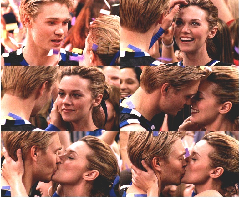
Ok guys. I saved the best for last. It's the eyeshadows and one highlight shade from the One Tree Hill collection. I will admit that I shed a few tears while swatching these. Mainly because this:
From left to right: Sunrise highlight/blush, Game, Keith Scott, Sawyer's Heart, Comet, Unkindness of Ravens, and Rivercourt

And a closeup of the shimmery shades (minus Rivercourt)!

1) Sunrise highlight/blush - A light pink with strong blue/purple interference and peachy orange duochrome. Wow, that is a lot of colors! I think I definitely get the blue/purple, but not so much the peachy orange.

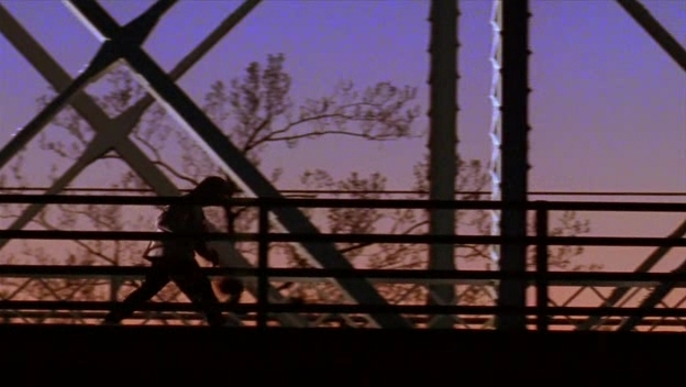
This shade is meant to emulate the color of the sky in the opening credits where Lucas dribbles a basketball across the bridge during sunrise. Can you hear it? Can you hear Gavin DeGraw like I can?
2) Game - A medium orange that looks amazing with browns and all blues. This shade was holy damn glorious. It is like a basketball that was blessed by the wings of a phoenix. Dat shimmer. The shimmer is slightly more apparent over PE, but not much.


A true bonding moment.

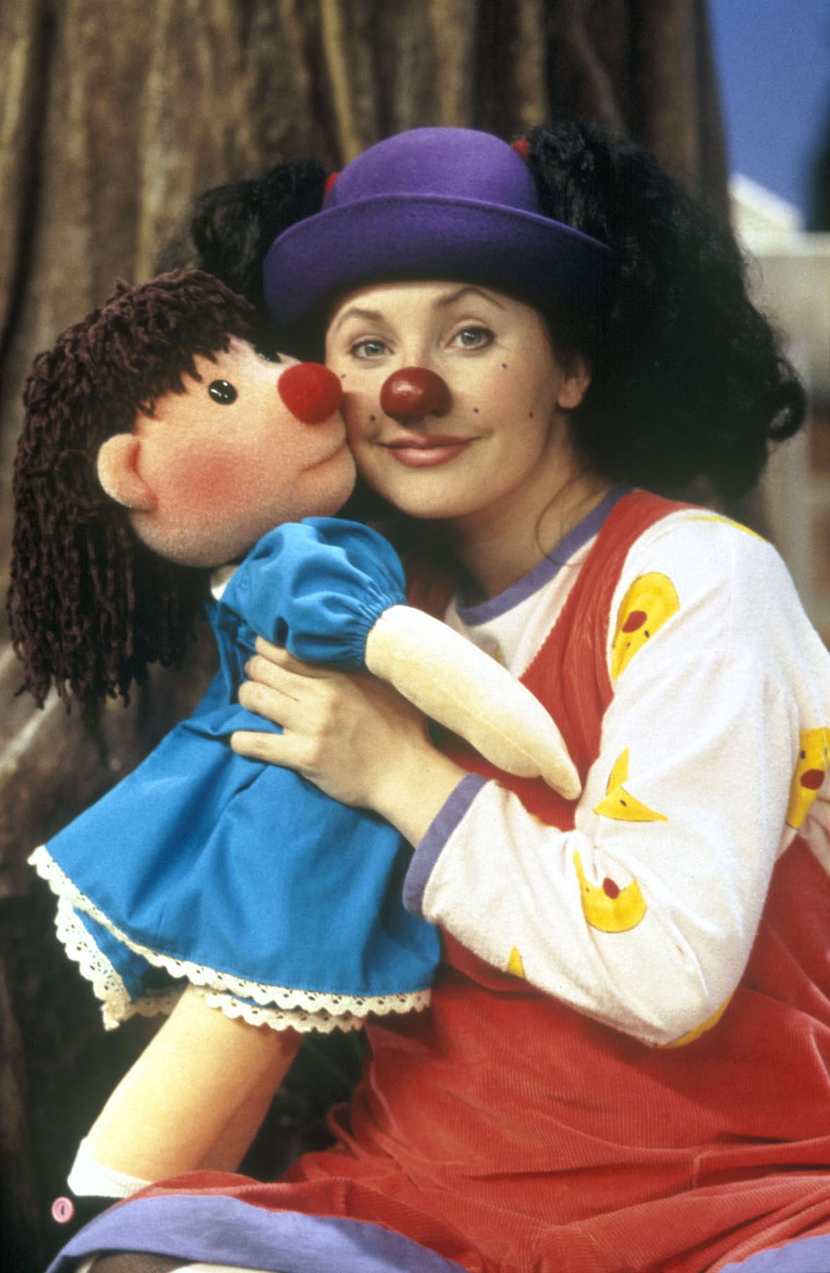
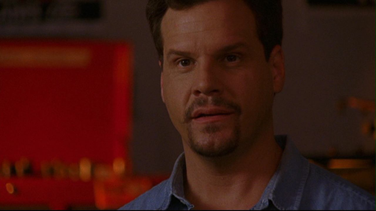
3) Keith Scott - Ok, here's where I started to get a little watery. Keith Scott was one of my favorite characters on the show. As a counselor, I do have a soft spot for Haley, and Peyton will always be bae, but Keith is just that father figure. He wasn't perfect, but he tried so hard for Lucas and always seemed to get the short end of the stick. As did this eyeshadow swatch with my unfortunate taping and not reading that it was an semi-matte and put it over PE anyways. So, please ignore the right side of this swatch over PE, as this shade really does not need it. Also, f*ck Dan Scott. Ok, I'm getting heated, I need to move on. Ugh season 4 feels.

4) Sawyer's Heart - A light red eyeshadow with red, blue, and yellow duochrome. Out of the whole collection, the inspiration for this shade was truly my favorite, and so incredibly intricate. The light red base of the heart served as the base for the shadow, along with the golden flames extending from the heart and the blue 3 as the duochrome finish. On me, this definitely pulled more pink than it did red. I do see some of the blue, but not as much gold. However, to honor the inspiration behind the shadow (because I am really Really REALLY f*$*ing cheesy like that), I will definitely pair it with golds and blues. :')
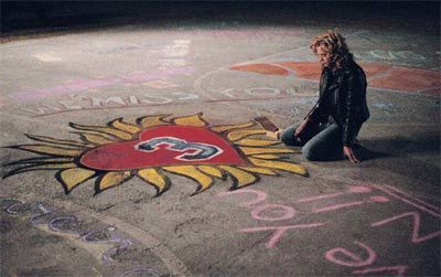


5) Comet - A medium bronze with peach duochrome and gold and red/pink sparkles. I think this shade definitely benefits from a sticky base, and is, in my opinion, worth it. It is a tad sheer over TFSI, especially the deeper purple of the base. The inspiration for this shadow comes not only from Peyton's car, which is a Comet, but also from the painting of a comet Peyton completed in Season 5 (I cry, season 5) on the Rivercourt.


6) Unkindness of Ravens - A dark blue, almost black, with blue duochrome and silver sparkles. I have a love-hate relationship with eyeshadows with black bases. They can be so finicky, so I was really hesitant to try this. Fortunately, it did well, and the sparkle really adds a great touch. It was a little patchy over TFSI, but not over PE. This shadow spoke to me because what I really loved about Lucas Scott was that he was also a writer and in touch with literature (which is so hnnggggg to me). His published novel was entitled An Unkindness of Ravens, and one of my favorite parts of the show was watching the struggles and triumphs of his novel and writing inspiration, which was one of the avenues by which he discovered that Peyton was really and truly The One. sigh and the second novel was called the comet and lindsey left him over that and sorry spoilers but i just can't contain my excitement and i really want to finish this post so i can turn on netflix and watch season 5 again


7) Rivercourt - A medium silver grey eyeshadow that leans towards blue. It has subtle green, blue, and gold duochrome, with blue and green sparkles. Ahh, the Rivercourt, where it all began and ended.
The green is not so apparent in photos, but moreso in person. This shadow delivered all that it promised - silver, blue, grey, and green. Reading Brija's description of the eyeshadow truly broke my heart. I had no idea that the actual Rivercourt location was torn down! And am super jealous that she got to go and see some filming locations... although I don't know if I would like to see the place where Psycho Derek fell down the stairs. Whenever I see him in another TV show, I cannot watch that show. I really can't. It just scares the shit outta me.


I think out of all the indie companies I've reviewed, Brija Cosmetics really touched me the most with the intense detail she puts into the inspirations behind each shade. I am looking forward to making another purchase with the birthday coupon code and trying out some more eyeshadow shades, and maybe grabbing a full size of a couple shadows and blushes!
As promised, here's a look I did with Woogity Woogity Woogity all over the lid, and Not a Kilt in the crease. I also am wearing October 3rd blush blended out.


OK NOW I CAN GO WATCH OTH ON NETFLIX BYE
