Dawn Eyes Cosmetics has been on my "to-try" list for a little while now. After some larger purchases such as Shiro's anniversary sale, Aromaleigh's 20% off sale, and purchasing two Disney x Sephora palettes from a friend of mine, I figured it was time to jump the gun and grab some samples from Dawn Eyes!
I was not paid by Dawn Eyes Cosmetics for this review, and purchased all products with my own money.
Dawn Eyes Cosmetics offers most of their sample baggies for $0.50 (except for a couple collections, including the Spearl Mattes, of which I ordered several), which is a steal, considering most other indie shops sell baggies at around $1.00 apiece. I took this as a neon sign that said "now you can buy DOUBLE the amount of samples you want to!" and so I did...
However, I will note that the website is on the more cumbersome side to navigate. I experienced some issues with loading all my desired samples (that I took around a week to compile in a list, I'll have you know!) into my Paypal cart, only for my Paypal cart to puke out more than half of them upon attempting to check out. To avoid this situation, Dawn offers the option of emailing her directly with a list of items that you wish to purchase, and she will invoice you directly with a final total.
I did have a couple other mild qualms about my experience. The search feature on the website is really an extension of Google, which I found mildly irritating, as I would have preferred a more streamlined experience on the Dawn Eyes website itself. As well, the photo swatches on the website leave a little something to be desired. However, there are video swatches for some of the eyeshadows, which are extremely helpful, as it really catches the difference between the base and the shift for some of these shades, whereas I find other websites can photograph just one angle (sometimes the most flattering angle) of each shade.
Date order was placed: May 20
Date order was shipped: May 26
Date received: May 29
Dawn was so kind and emailed me after I placed my order letting me know that instead of shipping within a couple days, she would ship the following Tuesday (Monday was that of Memorial Day long weekend), and that she would include some extra samples for me. I was in no rush to receive my order and this was above and beyond what was expected, so thank you, Dawn! The turnaround time was one of the fastest that I've seen with an indie shop, and I am very impressed with the customer service.
My sample baggies arrived in a bubble mailer, and were simply packaged in a Ziploc baggie which was taped securely shut.

As usual, all swatches were done on my NC30 skin tone and photos taken in natural lighting.
Here are the matte shades that I ordered. I heard wonderful things about Dawn's matte formula and I wanted to try a few (ok a lot of) shades. Particularly, I have been looking for:
- A crease color that is versatile and complimentary to my NC30 skin tone
- A dupe for "Cream" in the Lorac Pro palette
- A dupe for "Muse" (a dark matte cranberry) in the Lime Crime Venus palette
Aaaaaaand you know me, had to spring for the mint green and the lavender because I am always on the hunt for a (more) perfect mint green and lavender for that pop of color on the middle of my lid!

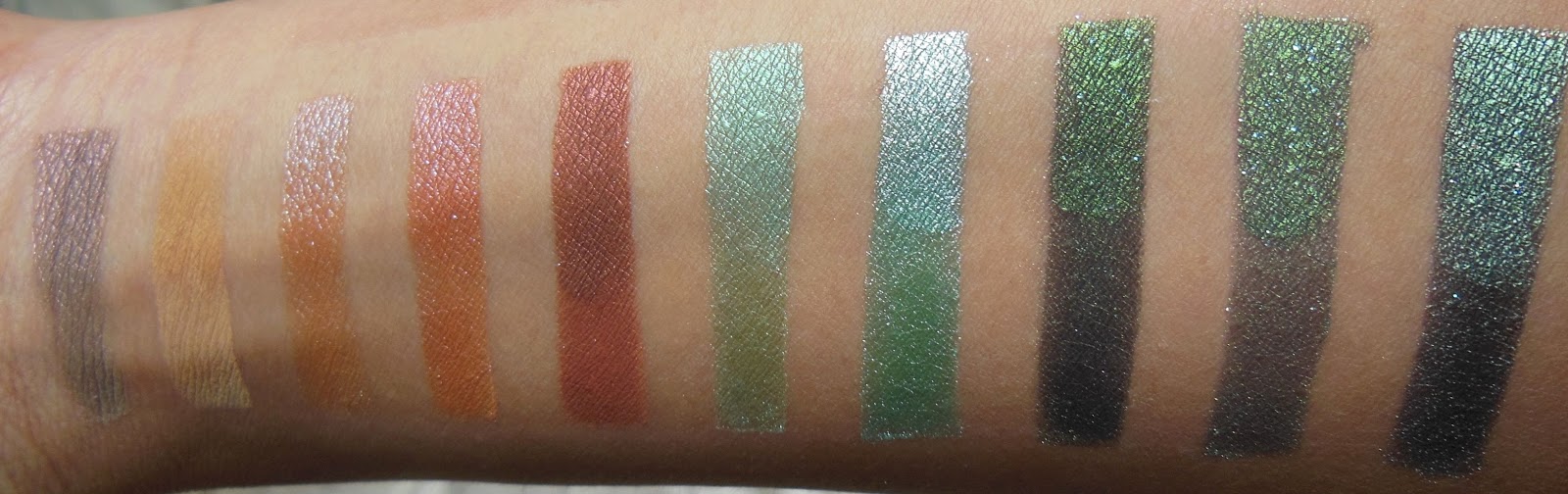
Swatches from left to right are as follows: Cream, Beige, Goldenrod, Cinnamon, Milk Chocolate, Taupe, Dark Taupe, Minty Green, Pale Fuschia, Cranberry, and Sea Blue.
These swatches were done over Too Faced Shadow Insurance with a short shader brush.

Descriptions in bold below are directly from the Dawn Eyes Cosmetics website.
The Spearl Mattes are described as having a high level of both silk and pearl powders, which both have long-proven nutritional properties for skin. They also lend a creamy silken feel, an amazing ease of application, and a wonderful color payoff. (Exclamation points modified to periods because I am more of a full stop kinda gal and use pep in my step in sparing amounts). They do not have individual color descriptions, so I will name the shade, make my own remarks, and display its corresponding photo and swatch. I will just note that the Spearl Mattes are $1 for a sample baggie and $6 for a full size, instead of the usual $0.50 and $3.00, respectively.
1) Cream Matte - I really really like this shade. When compared to my swatch of Corvus Cosmetics's Euterpe, it is slightly more yellow/beige and a little darker, which goes well with my skin tone. I'm not sure if there is enough difference to order yet another full size of a cream matte shade, but it will definitely be on my list once I am done with Euterpe Between the two, I most definitely won't be repurchasing a whole new Lorac Pro once I am done with my current one! It was a very pigmented shadow. A little went a long way, and it didn't apply very patchily.


2) Beige Matte - This shade can definitely be used as a transition shade. It is a little more pink and peach than I would have liked, and I don't think I will be purchasing a full size, but it is a versatile shade and I can definitely find use for it. It went on more patchy than Cream and was slightly less pigmented but still performed well.


3) Goldenrod Matte - Another shade I am always on the hunt for and welcome in my collection is a Rapunzel's hair shade (what, you really thought I could go a blog post without referencing Rapunzel? Think again wahahahahaha...). This is so pigmented. I definitely had way too much product on my brush than necessary to complete this swatch. I will admit that I don't use matte yellow/oranges that much but for this, I just might. Dang, this is nice! It's a perfect golden matte color and if you need one for your collection, I would most definitely recommend this one.


4) Cinnamon Matte - You guys. I miiiiiight just have found my crease/blending/transition/whatever shade! And holy hell, it would be called cinnamon (I would give my left... arm for a warm cinnamon bun... that sticky gooey innermost almost-cooked doughy swirl just makes me unf). It is just medium brown enough with a tad of yellow/orange but no red (this is a qualm that I had with Sable in the Lorac Pro palette - it showed up a little red on my skin). It could afford to be a little bit darker but I think I might just spring for a full size of this! Hallelujah!


5) Milk Chocolate Matte - This shade gave me a little bit of trouble in its application. It was one of the least pigmented of the mattes and applied too patchy for my liking. It took a couple dips into my baggie to achieve this opacity. It did not pass the test for my crease color but may work for someone with a cooler skin tone or an look involving cooler toned shadows. Definitely not my favorite of the bunch.


6) Taupe Matte - This shade as well as dark taupe actually pulled really purple on me (compared to the website swatch), and I'm not quite sure why. It looks almost like a lilac/pink in my swatch. I am definitely able to pair this with some more purple/pink shadows in my collection but don't think I'll opt for a full size, as it did not give me the results I was looking for in a true taupe matte. However, the pigmentation was very strong and applied nicely.


7) Dark Taupe Matte - As with taupe, I did not get the results I was looking for here, even though this is a really beautiful shade and was one of the most pigmented of the mattes, applied smoothly and was not patchy at all.


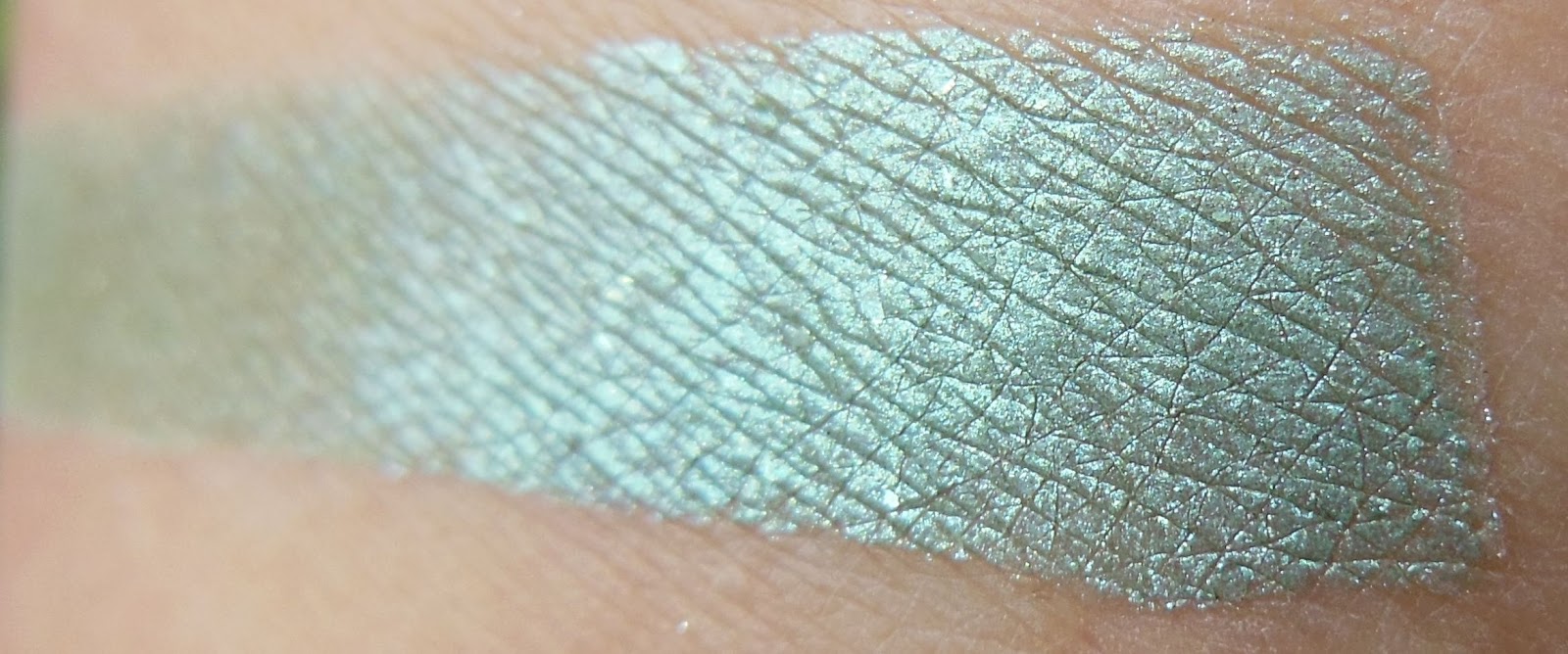
8) Minty Green Matte - I was most disappointed in this shade. It was pretty sheer upon first application but fortunately it was buildable to an opaque matte finish, after a few dips back into my baggie. Comparing this with the other mattes, it was the least pigmented and more difficult to work with. However, the end result after adding more product is a beautiful minty green, and the desired opacity was achieved after some hard work, unlike some other shadows (Venus palette shimmery shades, I'm looking at you) which just don't build up at all no matter how much you cake on.


9) Pale Fuschia Matte - This was another paler and brighter shade than Minty Green, and performed better. I needed just a little more product after my first dip in my baggie to achieve the swatch I did. The result was a gorgeous lavender purple, a little purpler than Rapunzel's dress, and it is definitely something that I will be looking to add to my collection in the future.


10) Cranberry Matte - This matte cranberry definitely performs much much much better than its counterpart in the Venus palette. It took me a little extra product to build up to the swatch I achieved, but nothing major. It is definitely pigmented and applied smoothly. Compared to the others, the texture of this is a little more powdery and less silky, but that didn't make too much of a difference in its application, just how much product it kicked up.


11) Sea Blue Matte - This shade, like Minty Green, was less pigmented than the others and took more product to build up to its final product. It is definitely buildable though, but, visible along the edges of the swatches, is more sheer than the others.


Did you really think we were done? NO WE DEFINITELY AREN'T. I have not one, but two more armfuls of swatches to show you - and believe me... the best is yet to come. Below are all of the shades I got that were not part of the Spearl Matte collection. Each was $0.50, and some of the extras that Dawn threw in are here as well!

And here is the second armful of swatches! I did them half on Too Faced Shadow Insurance, and the other half is Fyrinnae's Pixie Epoxy over TFSI.
From left to right, we have: Mystic Mist, Six Seasons and a Movie, Soft Blue Beige, Paramour, Harvest Moon, Blue Horses, Green Chrome, botched Seaweed swatch, real Seaweed swatch, and Elf.

Here's a slightly different angle where you can see the sheen more prominently:
1) Mystic Mist - A soft grey/green base with a pink sheen that shifts to gold, no added sparkle. Neutral and versatile, this magical color will go with anything! Ooooh. This is really beautiful. It's got just enough sheen to be a more interesting neutral and will add a little pizazz to a neutral look. I'm not sure I personally would get much use out of it but Dawn added this to my order and I can see several shades in my current collection that I can use this with. It is surprisingly pigmented for such a light shade - a very pleasant surprise! The PE definitely darkens the base and makes the shimmer stand out more.


2) Six Seasons and a Movie - A light peach matte, no sparkle. So this is a matte shade and I did not realize it because this is another one that Dawn generously gifted to me, and had already applied Pixie Epoxy to my arm blindly before I realized that the shade was a matte. The actual shadow's result as applied over regular primer is on the left! This is another beautiful smooth matte, but it is very similar to Goldenrod, and I would definitely choose the more vibrant Goldenrod over this. As you can see, it almost blends in with my skin!

3) Soft Blue Beige - Light beige with a strong blue overtone, especially over primer, loaded with golden sparkle. Oh wow. This is everything that the name promises. It's both blue and beige, but not obnoxiously and obviously so, like Mac's Blue-Brown (my first duochrome love). I especially love this because it can be used with cooler tones because of the blue, but also with warmer tones because of the warmer base. As you can see, the PE doesn't especially make the blue pop, which is great, because I have no patience for the stuff 9 days out of 10!


4) Paramour - A medium semi-matte orange with a pink overtone and pink shimmer, minimal sparkle. I was expecting a little more pink with this shadow. I get mostly orange from it, and the PE only darkened the base, and did not bring out the pink any more than over regular primer. I was expecting kind of a reverse Rapunzel Had Extensions (from Fyrinnae) but was disappointed in this shade.


5) Harvest Moon - Deep orange bordering on brown, with hints of pink, naturally shimmering but no sparkle. Ok, I am just gonna take this time to mention how much care Dawn puts into her descriptions. This one is to a T - it really is deep orange bordering on brown with a hint of pink. The PE brought out more sheen but not a huge difference. Really impressed.


6) Blue Horses - Beautiful green with a strong aqua shift, even bordering on lavender, loaded with bright aqua sparkle. Ok here's where it gets serious. My mint green eyeshadow obsession is as strong as ever. Blue Horses really popped over PE. It was a little sheer even with a lot of product over just regular primer on the left, so I don't think I will be adding it to my collection as I have some tried and true mint greens that really pop over regular primer.

7) Green Chrome - True green metallic, think dewy new grass. Oooh, now we in business! The base turns more blue over PE, and I definitely prefer the more true green, seafoam of the regular primer swatch. There's just enough sheen to make this color really pop. This is going on the list of mint greens!


8) Seaweed - Lush and bright yet deep green, loaded with brilliant blue and green glitter! I really had to keep the exclamation point (but was not courageous enough to keep the rest of the hyperbole) here because wow, that glitter! There are large chunks of blue glitter in this one but it makes it so vibrant, and it absolutely glows over PE. I don't yet have a duochrome with a strong deep green base so I will consider getting this in a full size.


9) Elf - Black-based foresty emerald green sparkling with holographic glitter! Dang, this is nice. I usually have issues working with black bases - they turn out patchy, sheer, not-black, and every other thing wrong with an eyeshadow under the sun. This applied smoothly and the effect over PE really speaks for itself. I'm not sure I will purchase a full size, because not a lot of my shadow looks involve black, but I will find some good use for this sample baggie.


Okay, I am going to say that my next armful of swatches has some of the most beautiful shadows I have in my collection. My favorites from this Dawn Eyes haul are all on this arm and I am absolutely in love! From left to right here we have: Mossy Mauve, botched Northern Lights swatch, Siren, Mystic Ocean, Enchantress, Blue Spruce, Puck, Wicked, Genie, Nymph, Open Ocean, and Nisse. There is a bonus Northern Lights swatch on the side since I messed up the one in the lineup!

Here are some different angles, with the order switched.


1) Mossy Mauve - Deep mauve matte base with a shimmering teal overlay, not sparkly but very lustrous. This shade is more understated over regular primer and the teal was not very obvious, but I think it became a whole other shade over PE. Sometimes these more nude shades can tend to blend in with my skin tone but I love these shimmers that Dawn adds to neutrals that makes them more special, like in Mystic Mist as well.


3) Siren - Black based burgundy brown dripping with holographic glitter. This really is dripping with holographic glitter. The glitter chunks are large and gold and they make all of these shades look really royal, with the jewel-toned black bases. This shadow applied SO velvety smooth, and the base looked very similar over regular primer and PE. The PE makes the large glitter stick better but that's about it and I would not hesitate to just use this over regular primer.


4) Mystic Ocean - Deep purple/green base completely loaded with color-shifting glitter that goes gold/green/aqua. Oh. My lord. Do you see that. The second picture. I'll just let it speak for itself. It's almost ombre. I love purple. I love mint green. I love gold. I need a full size. Or ten. It went on so smooth and was so pigmented.


5) Enchantress - Black based plum bordering on purple loaded with holographic glitter. This is another of the Faery Dust collection, and I really liked how this whole collection performed. While there were definitely massive pieces of glitter (and I am generally not a glitter person), these are so gorgeous and not one of them applied patchy. I have too many purples in my collection at the moment to grab a full size but I will be coming back to the Faery Dust collection for some FS in the future!


6) Blue Spruce - A medium brown base lies under a bright forest green with a shift to teal, drenched in golden glitter. Hnnngggggggg. HNNNGGGGG. Oh my lawdy. This and Mystic Ocean take the cake by a mile for my two absolute favorites of this bunch. I would say that this doesn't really need PE to perform well, but if you want to emphasize more of the blue, I would apply over a sticky base. The blue and brown balance out nicely without it.


7) Puck - Black based golden brown loaded with holographic glitter. Ooooooh yesssssss. This is another from the Faery Dust collection and again, the formula is probably one of the best I've used from any indie makeup company. Dawn nailed the description - it is both golden and brown. I'd use this for a more shimmery crease color.


8) Wicked - Black based deep ruby tinged with magenta and slight shifts to a deep gold kissed cinnamon, flashing with bold golden glitter. Oh man. This is my third favorite of all the shadows I picked up. It just screams Jafar and/or Mother Gothel. Both of them. All of them. Ugh. So nice. Formula fantastic. Nothing but good things to say about this. The gold glitter came in little... flakes? They are not exactly circular, which I think makes it more special.


9) Genie - Black based golden olive, dripping with holographic glitter. This is like Genie from Aladdin, after he's released. cries Some of the holographic glitter is light blue in some lights, so it really is like Genie in his magic lamp. I'm not sure that I could incorporate such a bright, prominent olive into my regular eye looks but I'm willing to experiment with the sample baggie.


10) Nymph - Black based teal blue sparkling with holographic glitter. I would definitely say that out of all of the Faery Dust collection that I received, this was one of the two that differed most between regular primer and PE. The black base is pretty obvious over regular primer, so if you want to make the teal/blue really show up, I would use a sticky base.


11) Open Ocean - Beautiful deep blue with a violet undertone, glistening with blue and copper sparkle. This is so reminiscent of an open ocean. It is a true blue. I don't get very much of the copper sparkle, if at all, but the blue is super pigmented.


12) Nisse - Black based dark pewter sparkling with holographic glitter. Dawn also sent me this one as an extra, so thank you again! This is the second of the Faery Dust collection that I received that performed much better over PE, and the black base is again very obvious over regular primer. This isn't something I would normally go for, as I don't use silver or pewter very much, but if you like pewter this is one for you.


So that's it! Did you make it? Did you really? Overall, I am so impressed with Dawn Eyes Cosmetics. With most of the samples being $0.50 a baggie, I would definitely recommend picking up more than the usual sample haul. They are most definitely worth it. I will be going back for some full size soon! (aka. after paying summer school tuition cries grad school life)
